The Complete Snowflake Car Wash Analytics Project
Phase 6 is the finish line. We built the reporting layer — two views in CARWASH_ANALYTICS.REPORTING that aggregate daily KPIs and lifecycle summaries — then connected them to a live Snowsight dashboard showing $34,446.30 in revenue, 800 visits, and the full member lifecycle breakdown. This post closes out the series and reflects on what was built across all six phases.
Six Phases, One Complete Data Warehouse
Before diving into Phase 6 specifically, it’s worth stepping back and seeing the full picture. This series started with a blank Snowflake trial account and ended with a live dashboard backed by a properly layered analytics architecture. Here’s everything that was built:| Phase | What Was Built | Schema / Location | Feeds Into |
|---|---|---|---|
| 1 | Warehouse, databases, schemas, roles | CARWASH_RAW + CARWASH_ANALYTICS | Everything |
| 2 | 5 tables — dimensions and facts | CARWASH_RAW (LOCATIONS, CRM, POS) | Phase 3 data load |
| 3 | 2,613 rows via INSERT + COPY INTO | CARWASH_RAW (all 5 tables populated) | Phase 4 queries |
| 4 | 3 analytical queries | Snowsight — analytical_queries.sql | Phase 5 model inputs |
| 5 | V_MEMBER_LIFECYCLE view | CARWASH_ANALYTICS.MARTS | Phase 6 reporting + Braze |
| 6 | V_DAILY_KPIS + V_LIFECYCLE_SUMMARY | CARWASH_ANALYTICS.REPORTING | Snowsight Dashboard |
| 6 | Car Wash KPI Dashboard | Snowsight Dashboards | Stakeholders / hiring managers |
View 1 — V_DAILY_KPIS
The first reporting view aggregates three separate data streams into one daily summary table: revenue from TRANSACTIONS, visit counts from VISITS, and new member signups from MEMBERS. A FULL OUTER JOIN stitches them together so that a day with visits but no revenue (or vice versa) still appears in the output rather than being silently dropped.
					CREATE OR REPLACE VIEW CARWASH_ANALYTICS.REPORTING.V_DAILY_KPIS AS

WITH daily_revenue AS (
    SELECT DATE_TRUNC('day', transacted_at) AS date_day,
        SUM(amount) AS daily_revenue,
        COUNT(DISTINCT member_id) AS paying_members
    FROM CARWASH_RAW.POS.TRANSACTIONS
    WHERE transaction_type = 'RENEWAL'
    GROUP BY 1
),
daily_visits AS (
    SELECT DATE_TRUNC('day', visited_at) AS date_day,
        COUNT(*) AS total_visits,
        COUNT(DISTINCT member_id) AS unique_visitors
    FROM CARWASH_RAW.POS.VISITS
    GROUP BY 1
),
daily_signups AS (...)

SELECT ... FROM daily_revenue r
FULL OUTER JOIN daily_visits v ON r.date_day = v.date_day
FULL OUTER JOIN daily_signups s ON r.date_day = s.date_day
ORDER BY date_day DESC;
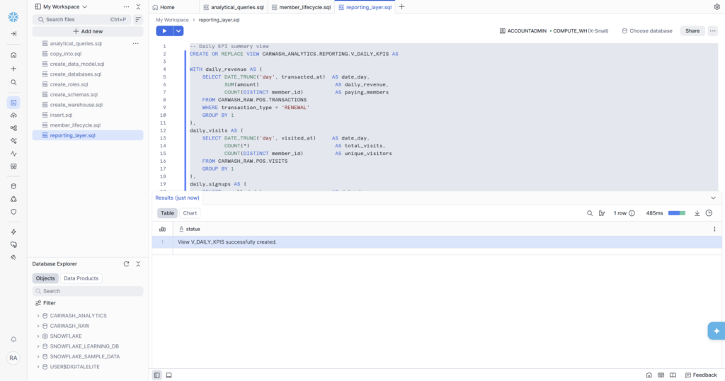
Why FULL OUTER JOIN?
This is a deliberate choice that matters in production. Consider a holiday weekend: visits happen but no renewals are billed (billing runs on the signup anniversary date). An INNER JOIN between daily_revenue and daily_visits would drop that day entirely — because there’s no revenue row to match the visit row. A LEFT JOIN from revenue would also drop it. A FULL OUTER JOIN preserves every day that appears in any of the three streams, filling missing values with NULL rather than hiding the day completely. Dashboard trend lines stay continuous instead of having mysterious gaps.
View 2 — V_LIFECYCLE_SUMMARY
The second view reads directly from V_MEMBER_LIFECYCLE — the Phase 5 model — and aggregates it into a per-segment summary. This is the view that feeds the Lifecycle Segment Summary tile on the dashboard.
					CREATE OR REPLACE VIEW CARWASH_ANALYTICS.REPORTING.V_LIFECYCLE_SUMMARY
AS
SELECT
    lifecycle_state,
    COUNT(*) AS member_count,
    ROUND(AVG(lifetime_visits), 1) AS avg_visits,
    ROUND(AVG(days_since_last_visit), 0) AS avg_days_since_visit,
    ROUND(COUNT(*) * 100.0 / SUM(COUNT(*)) OVER (), 1) AS pct_of_total
FROM CARWASH_ANALYTICS.MARTS.V_MEMBER_LIFECYCLE
GROUP BY lifecycle_state
ORDER BY member_count DESC;
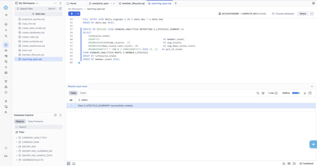
🏗️ The Reporting Schema vs MARTS Schema V_LIFECYCLE_SUMMARY lives in CARWASH_ANALYTICS.REPORTING, not MARTS. This separation is intentional. MARTS contains business logic models — V_MEMBER_LIFECYCLE with its CASE WHEN classification. REPORTING contains presentation-layer aggregations — summaries and rollups designed specifically for dashboards and stakeholder consumption. REPORTING views read from MARTS views, never directly from CARWASH_RAW. This layering means if the lifecycle classification logic changes in MARTS, the REPORTING view automatically reflects it without any code changes.
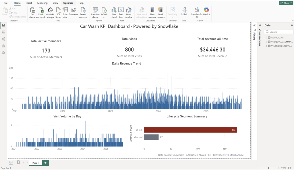
The Car Wash KPI Dashboard
With both reporting views live, the Snowsight dashboard pulls everything together. Five tiles, two chart types, three scorecards — all running against the views we’ve built across the series.| Tile | Type | Source View | Value Shown |
|---|---|---|---|
| Visit Volume by Day | Bar chart | V_DAILY_KPIS | Daily visit counts, Jan 2021 – Sep 2025 |
| Lifecycle Segment Summary | Bar chart | V_LIFECYCLE_SUMMARY | at_risk: 173 members, churned: 27 members |
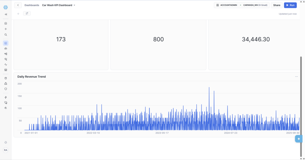
| Total active members | Scorecard | V_MEMBER_LIFECYCLE | 173 |
| Total visits | Scorecard | CARWASH_RAW.POS.VISITS | 800 |
| Total revenue all time | Scorecard | CARWASH_RAW.POS.TRANSACTIONS | $34,446.30 |
| Daily Revenue Trend | Bar chart | V_DAILY_KPIS | Daily revenue Jan 2021 – Sep 2025, peak ~$175 |
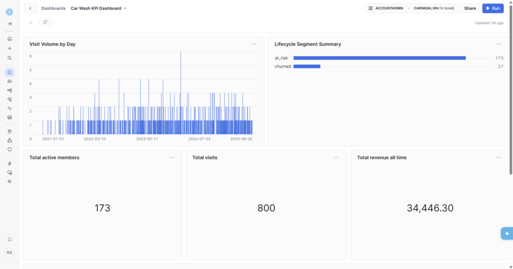
Reading the Dashboard — What the Numbers Say
The Three Scorecards
These three numbers tell the headline story at a glance:
- 173 total active members — the non-churned base. In a real business this would update daily as new members sign up and cancelled members drop off.
- 800 total visits — spread across 8 locations and 4+ years. The Visit Volume by Day chart shows the distribution: consistent activity throughout the period with a clear peak around mid-2024.
- $34,446.30 total renewal revenue — 1,370 renewal transactions at an average of ~$25 each. This is the MRR base that the Phase 4 monthly trend query broke down month by month.
Visit Volume by Day Chart
The bar chart spans January 2021 to September 2025 — the full range of our dataset. The density of bars is consistent across the period, with individual spikes reaching 5–6 visits on peak days. The chart reads cleanly left-to-right (oldest to most recent) giving an immediate sense of how visit volume evolved over time.
In a real deployment, this chart would show seasonal patterns — higher visit frequency in summer when cars get dirtier faster, dips in winter in cold-weather markets. Even with synthetic data, the chart demonstrates that the pipeline is working end-to-end: raw timestamps from CARWASH_RAW.POS.VISITS, aggregated by V_DAILY_KPIS, visualised in Snowsight.
Lifecycle Segment Summary Chart
The horizontal bar chart is the most actionable tile on the dashboard. at_risk (173) dwarfs churned (27) — which in context of the sample data is entirely expected (all active members’ last visits were 6+ months ago since our data ends in September 2025). In a live system, you’d expect to see all six lifecycle states here — the bars shifting as members move between segments each day.
This tile is what a VP of Marketing would look at first thing Monday morning. A growing at_risk bar means win-back campaigns need to fire. A shrinking churned bar means retention is working. The data engineer built the model that makes that conversation possible.
Daily Revenue Trend Chart
The full-width bar chart at the bottom of the dashboard shows revenue per day from the V_DAILY_KPIS view. The trend shows growing revenue density over time — more renewals per day as the member base accumulated — with a visible spike approaching $175 on a single day around mid-2024. This spike is likely a coincidence of multiple renewal dates aligning on the same calendar day in the synthetic data, but in a real business it could indicate a batch of members who all signed up during the same promotional period a year earlier.
Where This Project Goes From Here
This series covered the full data engineering stack from raw ingestion to dashboard. But a production system would layer several more things on top of what we’ve built. Here’s what the next evolution looks like:
- dbt — the SQL models in this project (V_MEMBER_LIFECYCLE, V_DAILY_KPIS) would become dbt models, gaining documentation, automated testing, and a lineage graph showing how each model depends on the others. This is the professional standard for analytics engineering.
- Airflow or Dagster — the manual SQL runs we did in Snowsight would become scheduled DAGs, running automatically every night to refresh the reporting layer with the previous day’s data.
- Fivetran or Airbyte — instead of CSV files loaded manually, a connector would pull directly from the real Salesforce CRM and POS system APIs, keeping CARWASH_RAW continuously up to date.
- Braze integration — the lifecycle states from V_MEMBER_LIFECYCLE would sync to Braze as custom attributes on each member profile, triggering automated campaigns without any manual export.
- Snowflake Data Sharing — the CARWASH_ANALYTICS database could be shared with a franchisee’s Snowflake account, giving them a read-only view of their own location’s KPIs without duplicating data.
As an Extra Bonus: I Recreated the Dashboard in Power BI
After completing the Snowflake pipeline, I took the same V_DAILY_KPIS and V_LIFECYCLE_SUMMARY views and connected them directly to Power BI. The dashboard visuals are nearly identical — same metrics, same charts — but now backed by Power BI’s refresh schedule and enterprise sharing capabilities.
This demonstrates the portability of the data layer: once your reporting views are clean and well-structured in Snowflake, connecting them to any BI tool (Snowsight, Power BI, Looker, Tableau) is straightforward. The hard part is building the right data model. The visualization tool is almost secondary.
Series Complete — What We Built
✅ Full Series Deliverables
- Phase 1: Snowflake environment — 1 warehouse, 2 databases, 6 schemas, 3 roles with grants
- Phase 2: Data model — 5 tables (LOCATIONS, MEMBERSHIP_PLANS, MEMBERS, VISITS, TRANSACTIONS)
- Phase 3: Data loading — 2,613 rows via INSERT (11 rows) and COPY INTO (2,602 rows)
- Phase 4: Analytics SQL — member status, MRR trend (56 months), location rankings
- Phase 5: V_MEMBER_LIFECYCLE — 6 lifecycle states, 200 members classified, NULL_COUNT = 0
- Phase 6: V_DAILY_KPIS + V_LIFECYCLE_SUMMARY + Car Wash KPI Dashboard
- Dashboard: 5 tiles — 2 bar charts, 3 scorecards — all live in Snowsight
- Numbers: 173 active members | 800 visits | $34,446.30 revenue | at_risk 173 | churned 27
- All SQL saved across 6 files in Snowsight workspace + GitHub repo